
PreSENTATION WORKs
So much of my work in this category has been proprietary or under NDA and can't be shown.
But here are things I can show...
PDF Downloadable Samples & Presentations
My experience/story in presentation form:
Examples of bad presentation slides and how we might fix them:
#1) Data Density without Design Clarity
Too much text – essentially a paragraph with bullet points instead of sentences.
Redundant nesting – bullets within bullets make it unclear what’s most important.
No visual hierarchy – everything’s the same font size and weight, so the key message gets lost.
No visuals or charts – data and relationships are described in words instead of shown.
Typographical errors – “Vaires,” “hanrd,” etc., signal rushed or unpolished communication.
Weak scannability – a slide like this overwhelms instead of reinforcing the speaker’s point.

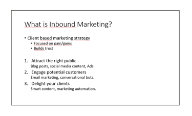
Too many bullets competing for attention (primary bullets + sub-bullets + numbered list).
Redundant structure — you have bullets AND numbers trying to do the same job.
No hierarchy — everything is the same weight, so nothing feels “most important.”
No visual anchor — no icon, illustration, or shape to help the brain categorize information.
No whitespace strategy — everything sits in one column of text, creating a dense block.
Underlines create visual noise — especially when they’re not links.
Not scannable — your eyes don’t know where to land.
A Solution:
Simplification has Power
It Makes the Message Clearer
The Solution:
Simplification to create clarity
And there's often more than one solution...
#2) Bullet Points Shoot Down the Message


#3) When Fruit Goes Bad

3D bars distort values — hard to compare, unclear true heights.
Overlapping bars cause visual clutter and hide data.
Too many colors with no legend; color meanings unclear.
Tilted perspective makes the axis labels and bars harder to read.
Category labels placed far from data, increasing cognitive load.
Unnecessary gridlines and depth lines create noise.
No clear title or takeaway, so the viewer must decode the chart.
A Solution:
Simplification is Still the Key...
...and Sometimes Audience Dependent


Generic
Exec
#4) Visual Hierarchy


"Your eyes follow the rules, whether the text follows them or not.
(Downloadable PDF)
Media Influence on Customer Conversion
A full-funnel framework for understanding exposure, sequencing, and lag.
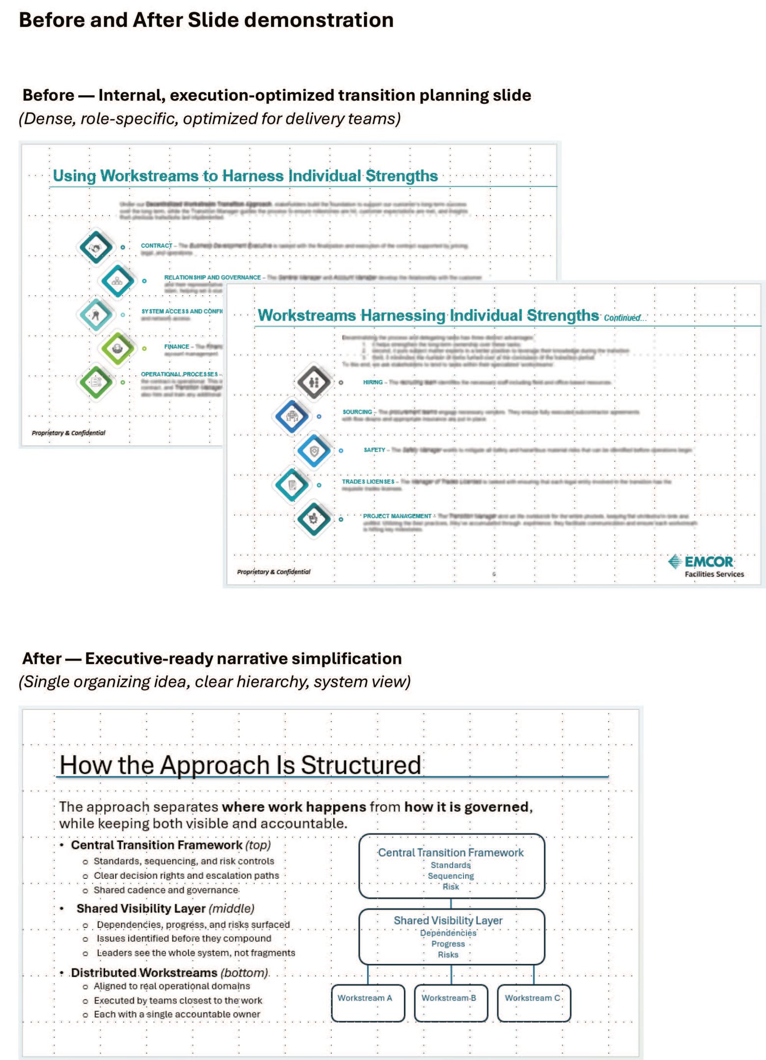
This anonymized case study demonstrates how I design executive narratives and governance systems for high-risk enterprise transitions.
It reframes transition failure as a design problem — not a people problem — and introduces a decentralized workstream model that separates execution from governance while maintaining visibility
and accountability.
Focus areas include:
Decision-right architecture
Escalation design
Lifecycle-based transition control
System-level risk containment
A demonstration of how I turn operational complexity
into structured clarity.
(Downloadable PDF)
A structured operating model for complex,
cross-functional change.
This anonymized analysis examines how online media exposure relates to site behavior, revisits, and downstream conversion.
Rather than relying on last-click attribution, it surfaces non-linear journeys, cross-format exposure patterns, and delayed lift windows — translating behavioral signal into executive-ready guidance.
Focus areas include:
Multi-format exposure analysis
Non-linear customer paths
2–3 day post-exposure lift
Cross-channel orchestration strategy
An example of turning analytics into decision-ready narrative.
(Downloadable PDF)
(Downloadable PDF)
(Downloadable PDF)


